


Enhancing Brochures with Visual Impact
March 6th 2025
Brochures serve as a powerful marketing tool, offering a compact yet detailed way to present your business, products, or services. Whether handed out at trade shows, mailed directly to potential customers, or displayed in public spaces, a well-designed brochure captures attention and effectively communicates key messages. While strong copy is essential, incorporating compelling visuals can elevate your brochure from ordinary to unforgettable. Let’s explore the ways you can make your brochures more visually engaging.
The Role of Visuals in Brochure Design
A well-chosen image can communicate emotions, ideas, and product benefits faster than words alone. When readers skim through brochures, their eyes naturally gravitate toward images before reading text. By strategically selecting and placing visuals, you can guide the reader’s attention to the most important details and make a lasting impression.
Choosing the Right Images
Selecting the right images involves more than just adding pictures—it requires thoughtful curation to ensure alignment with your brand identity and message. Consider these factors:
-
Authenticity: Use real, high-quality images that represent your business genuinely. Stock photos can be useful, but custom photography of your team, products, or facilities adds credibility.
-
Relevance: Ensure each image reinforces the brochure’s purpose. For example, if promoting a travel package, include scenic destination shots rather than generic office photos.
-
Quality: High-resolution images maintain clarity and professionalism. Avoid pixelated or stretched images that could diminish the brochure’s impact.
Creative Visual Approaches
To make your brochure visually dynamic, consider these innovative design techniques:
1. Full-Page Background Images
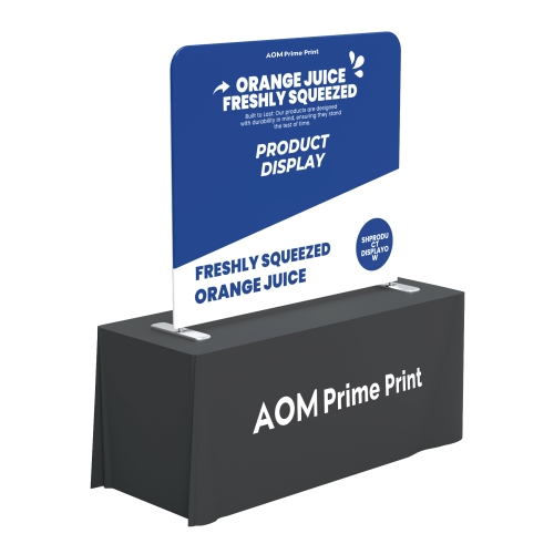
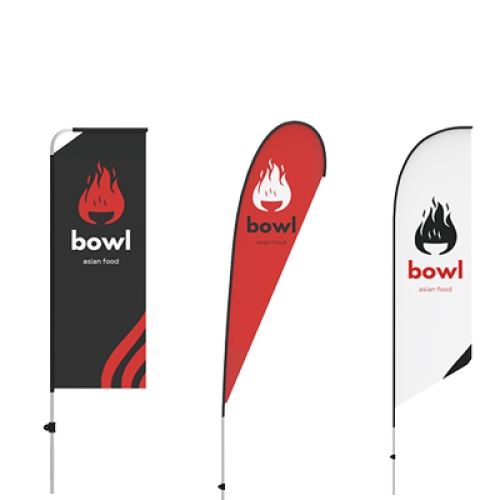
A striking, full-bleed image covering an entire panel can create a bold statement. This works well for showcasing landscapes, event photography, or high-impact product shots.
2. Layering Text Over Images
Overlaying text on images can enhance storytelling, but ensure readability by using contrasting colors, semi-transparent overlays, or bold typography.
3. Infographics and Icons
Rather than overwhelming readers with text-heavy sections, use infographics and icons to present key information succinctly. Charts, graphs, and symbols can illustrate complex data in a visually engaging way.
4. Thematic Visual Consistency
A consistent visual theme ties the entire brochure together. Whether using a specific color scheme, imagery style, or recurring graphic elements, cohesive design ensures a professional and polished look.
5. Interactive Design Elements
Consider incorporating fold-out sections, QR codes leading to videos, or augmented reality elements that add an interactive dimension to your brochure, encouraging deeper engagement.
Balancing Images and Text
While images enhance appeal, they should not overshadow the main message. Striking the right balance between visuals and content is crucial:
-
Use whitespace effectively to avoid clutter.
-
Align images and text in a way that maintains readability.
-
Choose fonts and colors that complement, rather than compete with, the images.
The Power of Visual Storytelling
A brochure is more than just an information sheet—it’s an opportunity to tell a compelling story. Through thoughtful image selection and creative design techniques, you can create brochures that captivate audiences, reinforce brand identity, and drive engagement.
By integrating high-quality visuals, employing innovative layouts, and maintaining a harmonious balance between images and text, your brochures will stand out and leave a memorable impact on your target audience.
Strategic Brochure Design: Beyond Visual Elements
Creating effective brochures requires more than just attractive images—it demands strategic thinking about how your marketing piece will engage your target audience. While visual elements are crucial, let's explore the broader considerations that determine brochure success.
Understanding Your Audience's Journey
Before selecting any design elements, consider how your brochure fits into the customer journey. Is it an introductory piece that needs to quickly communicate your value proposition? Or is it a detailed follow-up that nurtures existing relationships? The placement in your marketing funnel should dictate content density, technical specificity, and call-to-action strength.
For example, tradeshow brochures should be scannable and memorable, while mail-order brochures may contain more detailed specifications and ordering information. Understanding this context helps you balance visual appeal with functional requirements.
Psychology of Layout and Navigation
How readers physically interact with your brochure significantly impacts information retention. Consider:
- Reading patterns: Western audiences typically follow a Z-pattern when scanning content. Position key messages along this natural eye movement path.
- Fold strategy: Each fold creates a natural pause and reveals new information. Use these transitions to build narrative momentum or separate distinct offerings.
- Information hierarchy: Guide readers through content using size contrast, white space, and directional cues that subtly indicate "read this first, then this."
A well-designed brochure anticipates how readers will unfold and explore the content, creating moments of discovery that maintain engagement.