Color Psychology in Booth Design
October 10th 2024
Color plays a crucial role in booth design, not only drawing attention but also influencing emotions and memories. Color psychology reveals how different colors affect human psychological responses and decisions. By strategically using color, you can make your booth more attractive and strengthen brand awareness.
Red – Attention-Grabbing and Passionate
Red is often used to attract attention, symbolizing passion, strength, and action. In booth design, red can guide visitors' focus to key areas and create a vibrant atmosphere. However, too much red can be overwhelming, so it's best used as an accent color paired with neutrals to strike a balanced yet engaging look.
Blue – Trust and Professionalism
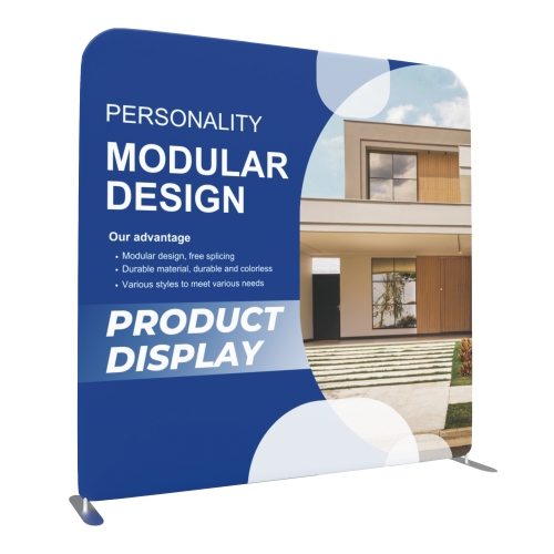
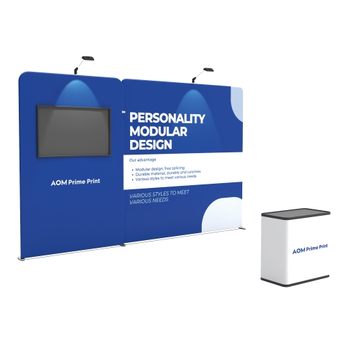
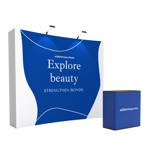
Blue is associated with calmness and professionalism, evoking feelings of trust and stability. Many technology and financial companies use blue in their booths to convey a sense of reliability and expertise. Blue is especially suitable for business-focused events, creating a cool, refreshing environment that encourages meaningful interaction.
Green – Nature and Sustainability
Green symbolizes nature, sustainability, and health, making it ideal for booths in the agriculture, food, and environmental sectors. Green communicates friendliness and relaxation, helping attendees feel comfortable. Pairing green with wood textures or natural materials can strengthen an eco-friendly image, attracting visitors interested in sustainability.
Yellow – Energy and Innovation
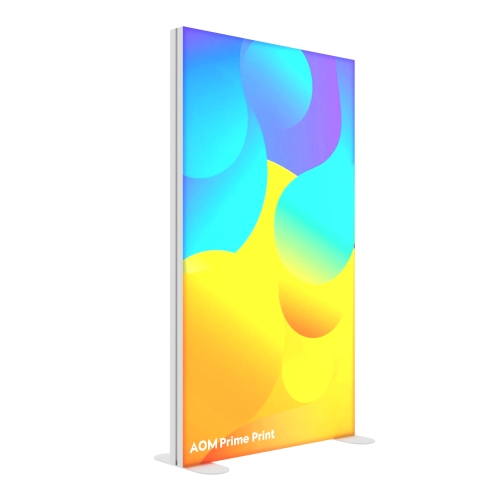
Yellow is vibrant and optimistic, conveying energy and innovation. It works well as an accent color to highlight product areas or key messaging. For tech and creative industry booths, yellow can express a young, dynamic spirit. Since too much yellow can be tiring, it’s best balanced with neutrals or cool tones.
Black and White – Classic and High-End
Black and white are often associated with sophistication and elegance, suitable for brands wanting to create a professional, polished image. Black symbolizes power and luxury, while white represents purity and simplicity. Together, they create visual impact and leave a lasting impression. In booth design, black and white are ideal for brands emphasizing quality, allowing for a clean, high-end look.
Gray and Neutral Tones – Balance and Professionalism
Gray and other neutral tones offer a balanced base, complementing brighter colors without overwhelming the design. These colors are understated yet enhance the professional atmosphere of the booth, suitable for almost any industry and theme.
How to Choose the Right Colors for Your Brand
- Target Audience: Select colors that resonate with your target visitors. For example, younger audiences may favor energetic colors, while professionals may prefer more subdued tones.
- Brand Identity: Ensure that your booth colors align with your brand’s visual style to enhance consistency and memorability.
- Booth Location and Lighting: In well-lit or prominent locations, softer colors can prevent visual strain, while brighter shades may help increase visibility in lower-lit areas.
Conclusion
Applying color psychology in booth design can significantly boost your brand’s appeal and recognition. By carefully selecting and combining colors, you can create a memorable booth that leaves a lasting impression on attendees and encourages engagement with your brand.

